“Colour helps to express light, not a physical phenomenon, but the only light that really exists, that is in the artist’s mind.“
-Henri Matisse
Since ancient times, color has mesmerised humans with its various shades and hues. Its use in art and its impact on day-to-day existence attest to its deep impact on our aesthetic, psychological and emotional experiences. This blog article examines the rich history and use of color in painting, its cultural significance and its indispensable function in daily life.
History of color in painting
Ancient beginnings
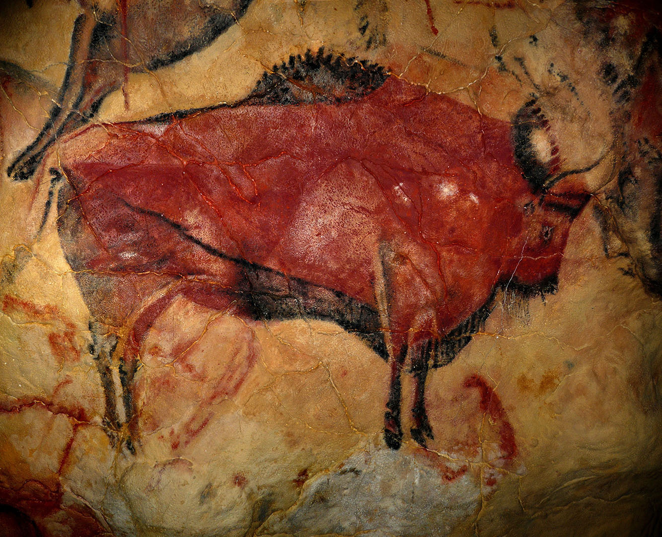
Prehistoric art: Color has been a part of art since prehistoric times; Cave paintings are one of the earliest evidences of mankind’s desire to depict the early use of color in painting. Natural colors made from organic materials, minerals and earth were used by these ancient artists. The earliest colors were ochre, charcoal and hematite, resulting in a limited but attractive palette of reds, browns and blacks.
Ancient Egypt: The color had deep symbolic significance in ancient Egypt, where it was widely used on objects and tomb paintings. The Egyptians believed that colors represented different aspects of life and the afterlife and had protective properties. For example, blue represents creation and the divine, while green represents fertility and renewal. Minerals such as lapis lazuli for blue and malachite for green were used as paints by Egyptian artists.
Classical antiquity
- Greece and Rome: The use of color in painting was further explored by Greek and Roman artists. The Greeks created brilliant and long-lasting paintings through the process of encaustic painting, which required combining colors with hot wax. Roman paintings, especially those that have survived and been preserved at Pompeii, displayed realism and the creative use of color to build texture and depth The Romans imported Egyptian indigo, cinnamon or vermilion for touch of the diffusion of colors.
- Middle Ages: Church and religious themes had a major influence on color in art during the Middle Ages. Biblical tales are typically depicted in illuminated manuscripts, which are superb illustrations of the vivid color schemes and gold leaf used in mediaeval art. Artists used natural pigments and minerals such as ultramarine, a very valuable blue pigment that was paired with lapis lazuli, which is usually reserved for painting the Virgin Mary’s clothes because of its high price.
- Renaissance: The use of color in paintings was influenced by the Renaissance, a renewed interest in humanity and in nature. Due to its versatility and colorful oil paintings, artists such as Leonardo da Vinci, Michelangelo and Raphael tried to use it. The use of chiaroscuro, or strong light and dark contrasts, and linear perspective added depth and realism to the images.
Leonardo created sfumato, a smoky combination of colors and tones. Michelangelo’s Sistine Chapel paintings are known for their vivid use of color to convey emotion and movement.
- Baroque period: Baroque painters such as Caravaggio and Peter Paul Rubens used color to add dramatic effect and emotional intensity. Caravaggio used a painting technique called Tenebridge, which uses strong contrasts of light and dark to create dramatic effects that draw the viewer into the painting, while bright colors and movement the pleasure is not. Rubens’s colorful and vivid paintings perfectly capture the Baroque style.
18th and 19th century
- Rococo: Characterised by its elaborate and elegant design, the Rococo period used color in light and sophisticated ways. Artists such as François Boucher and Jean-Honore Fregonard used pastels and soft colors to create dramatic romantic settings.
- Romanticism and Realism: The Romantic movement emphasise individual expression and emotion. It also often uses bright colors to highlight the sublime and powerful forces of nature.
Color: Eugene Delacroix, J.M.W. Turner to create atmosphere and mood. On the other hand realist artists such as Gustave Courbet and Jean-François Millet aimed to capture the harsh truth of their subjects with muted and earthy paintings to create everyday life of the figure - Impressionism: Impressionism changed the use of color in painting. Painters such as Claude Monet, Pierre-August Renoir, Edgar Degas departed from traditional techniques to represent the fleeting effects of light and atmosphere with short bold brushstrokes, bright colors. Colors expanded with the invention of dye, allowing Impressionists to create the bright and varied colors We do.
Monet’s concern with changes in light and color over time is evident in his series of paintings, “Water Lilies” and “Stacks of Grass.” The emphasis on natural light and complementary color shading made a big difference.
20th century and beyond
- Post Impressionism: Experimenting with new color palettes, impressionists such as Vincent van Gogh, Paul Gauguin and Georges Seurat built on their success. In other works, “Starry Night” and “Sunflowers,” Van Gogh’s use of color was expressive and emotive, emphasising his inner conflicts and desires. Pointillism, a style developed by Seurat , arranges color particles close together to create a visual blend from a distance.
- Modernity: Many paintings appeared in the 20th century, each with a color effect. Henri Matisse’s Fauvism was famous for its use of vivid and unnatural colors. Color was an important tool used by abstract artists like Jackson Pollock and Mark Rothko to evoke emotions and create stunning visual experiences.
Pop art, which included artists such as Andy Warhol and Roy Lichtenstein, used vivid and contrasting colors to represent late 20th century consumer culture and to challenge Its opposite minimalism often used monochrome colors to emphasise form and space. - Contemporary Art: Contemporary artists are still pushing the boundaries of color in their work. Global culture has combined traditions and influences, while digital technologies have expanded the possibilities of shaping and transforming color. The creative power of contemporary art is underpinned by artists such as Olafur Eliasson, who manipulates the environment with light and color, and Yayoi Kusama, known for her use of stripes and vibrant colors there for well.
Use of colors in daily life
Psychological and emotional effects
Color has a profound effect on our emotions, thoughts, and actions in our daily lives. The study of how colors affect human emotions and moods is known as color psychology.
Warm colors
Vibrant colors like yellow, orange and yellow are often associated with warmth, energy and comfort. They are often used in restaurants because it can increase their appetite. If used excessively they can also cause feelings of anxiety or anger.
- Red: Often associated with passion, enthusiasm and urgency. This works well for exit and sell signals because it can increase the pulse rate and create a sense of urgency.
- Orange: It combines bright red with the joy of red. It is associated with growth, happiness and productivity.
- Yellow: The color of sunshine representing contentment, hope and happiness. While it may be distracting, it should be used in moderation as it can irritate the eyes and irritate people.
Cool colors
Empowering relaxation, cool colors such as blue, green and red are often used in spaces that promote calmness and relaxation.
- Blue: Associated with professionalism, confidence and peace. It is suitable for office and bedroom use as it can lower heart rate and blood pressure.
- Green: Represents harmony, growth, and the natural world. It has calming properties and is often used in healthcare settings to promote healing and relaxation.
- Purple: combines the stability of blue with the intensity of red. It is associated with wealth, creativity and spirituality. Lavender and other light purple colors can make you feel peaceful and relaxed.
Cultural understanding
Color has different meanings and meanings in different cultures, influencing everything from fashion to customs and traditions.
Western cultures
In many Western cultures, colors have specific associations:
- White: Symbolises purity, innocence and peace. Commonly used in weddings and health care.
- Black: Represents elegance, sophistication and formality but also death and mourning.
- Red: Often associated with love, passion and danger.
- Blue: Symbolises trust, security and peace.
- Green: Represents nature, health and wealth.
- Yellow: Associated with happiness, caution and cowardice.
Eastern cultures
Color meanings in Eastern culture can be very different:
- Red: In China, red symbolises happiness, joy and prosperity. It is often used in festivals and weddings.
- White: In many Asian cultures, it is often associated with death and mourning.
- Blue: In Hinduism, blue is black and represents god.
- Green: In Islamic culture, green is associated with the heavens and is a sacred color.
- Yellow Yellow in India is associated with education and knowledge and is often worn in religious ceremonies.
Color in fashion and design
Color trends in fashion and home design mirror social sensibilities and tastes. Color is a tool that artists use to achieve a specific response.
– Fashion: Color is a tool used by fashion designers to communicate brand identity, set trends and tell stories. Seasonal color changes often reflect larger social, cultural, and economic issues. For example, in moments of happiness and beauty, vivid, rich colors are common, while in moments of uncertainty, muted, neutral tones are common.
– Interior design: Interior designers use color to create mood, define spaces, and enhance the functionality of a room.
Example:
– Living room: Warm and inviting colors such as soft beige, brown, red or orange create a cosy atmosphere.
– Kitchen: Bright colors like white, yellow or green can make a kitchen look clean and energetic.
– Bedroom: Calm, peaceful colors like blues.